
Thursday, September 21, 2017
Monday, September 11, 2017
Composition in Photography - Grade 11/12 Photography
1. Watch the video
2. Each student, working individually, should find 2 different examples for 5 of the photo composition tips using the following links only. (I separated pattern and interrupted pattern to create an extra tip)
National Geographic Photography
Getty Images Life Picture Collection (explore this site)
The Guardian - best photos
Please make sure that all students sign into the computers. For those that are unable to sign up due to password issues, please have another student log them in so they can work on this assignment.
Note: Do not search for the composition tips and find the photos that come up. You MUST only use the above three links provided and select photos that you think are great, and that match the different composition tips from the video. I have listed them again below, but feel free to watch the video over again or google any of the composition tips for more in depth information.
1. Rule of Thirds
2. Leading lines
3. Diagonal lines
4. Framing
5. Figure to Ground
6. Fill the Frame
7. Center the Dominant Eye
8. Patterns and Repetition
9. Interrupted pattern
10. Symmetry
3. ASSIGNMENT: Create a google slide presentation for 5 of the above compositional techniques
Title Page should state:
Composition in Photography
Your Name
Each slide should have a headline identifying the composition rule and the two photos you have selected to help identify it. Write a brief sentence at the bottom of each photograph explaining why you think that photo best demonstrates that particular compositional tip AND what you like about the photo.
10 marks - 1 for each photo that is correctly selected and identified (Knowledge/Understanding)
10 marks - 1 for each sentence that correctly justifies the choice of photos. (Bonus marks for further discussion about the photos) (Communication)
5 marks - for organization, layout, title page, care and completion (Application)
Total = 25 marks
Due at the end of the period. Submit to Google Classroom. Please note - the google classroom codes are for Ms. Silverman's Photography class.
Gr. 11s join class with the following code: xew6yc6
Gr. 12s join class with the following code: 6vj2l4
Monday, June 12, 2017
Important Principles in Graphic Design
http://www.printwand.com/blog/basic-alignment-principles-in-graphic-design-with-examples
Review basic alignment and make sure you are making a decision about which of the four types of alignment you are using to line up text and other elements (like pictures!)
https://www.smartdraw.com/brochure/basic-design-principles-flyers.htm
Review this to remember some basic principles of design when creating your brochure.
- Group related elements
- Align elements
- Consistency and visual unity
- Contrast and emphasis
- White space
Brochure evaluation will be based on you paying attention to and applying these principles.
Are related elements grouped together?
Have you paid attention to alignment?
Do you have consistency and visual unity (repeated elements, like graphics, colours and fonts - same size/font for headlines/subheadlines/body text)
Are you making an effort to create CONTRAST and EMPHASIS?
Do you have a reasonable amount of white space? No white space is simply not enough!!!!
Thursday, June 8, 2017
Culminating Activity Part 2 - Planning
Today's task to complete worth 5% will be on planning your brochure design - and submitting your paper rough copy that includes design ideas, photo and text placement and colour and graphic ideas. The more detail you have in your rough paper copy, the better.
Go through the same categories you went through to analyze the brochures you found online and write down ideas for each of the categories for your own brochure in a word document (or google docs).
i.e. You can actually just google "red colour swatches" and look for the colour you like
Then paste it like this:

Also you can look up something like "colour combinations with red" or "colour schemes with dark red"
and get something like this:


For example:
HEADING (helvetica 28 pt Bold)


Go through the same categories you went through to analyze the brochures you found online and write down ideas for each of the categories for your own brochure in a word document (or google docs).
1. Subject: Portfolio or Promotional (discuss your plan here. What content do you want in your brochure? Which tech areas?)
2. Colour: What colours do you want to use? And Why? What do you think those colours express?
For colour - find colour samples online, or in Photoshop to show your ideas.i.e. You can actually just google "red colour swatches" and look for the colour you like
Then paste it like this:

Also you can look up something like "colour combinations with red" or "colour schemes with dark red"
and get something like this:


3. Typography: Find fonts that you might like for your HEADINGS, Subheadings and body (that's all the text you write that says stuff)
For example:
HEADING (helvetica 28 pt Bold)
SUBHEADING (helvetica 20 pt. regular)
Body font (Trebuchet 12 pt. regular)
4. Design: Do you want it to look full and vibrant and colourful, or clean and simple and minimal and modern? Lots of space and breathing room, or jam packed full of images and info?
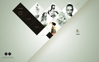
5. Shape: Will you have any distinctive shapes? Circles, squares, octagons? How will you use them? Will you place your photos next to eachother so they create a secondary shape? Or place them within that shape?
Like these:


6. Photography: How many photos will you have, of what and where will they be placed? Will they be lined up, placed very closely together or overlapping? Choose the photos you will be using and add them to your document.
Once you have done this, you can also take your paper and fold it the way you want and sketch out your design placing text and images where you'd like them to go.
Your rough layout should be as neat and careful as possible. (5%)
Monday, June 5, 2017
Culminating Activity - Brochure Design - Part 1 (5%)
Brochure Design Part 1. - Research and Analysis - DUE TODAY!!!
For any design project, once you know your objective (design a brochure for a specific audience), your next step would be to research other similar designs.
Today you will research and submit the following in a Microsoft Word document:
Save the document as Culminating_Research_Yourname.doc
1. Indicate whether you are choosing option A (Portfolio) or option B (Promotional) for your culminating brochure.
2. Indicate which type of folding option you would like (1 or 2 folds = 2 or 3 panel)
3. Search for 3 examples of brochures that are either portfolio or promotional (for school programs/schools). Research the option YOU chose.
What am I looking for?
You should look for brochures that catch your eye and that you think are really good designs. They might catch your eye because of colour, images, subject matter, graphics, typography or overall design.
4. Save each of your 3 favourite brochure designs (you can google search for them) and copy them into a word document.
5. For your absolute favourite one, write a few brief sentences answering the following questions for each category below:
A. Subject: What's the subject of the brochure
B. Colour: Discuss the use of colour - what colours are used. Are they bright and cheer, or calm and sophisticated? Using the colour psychology chart on the blog, take a guess at what you think the colours used express in emotions.
C. Typography: What does the font look like to you? Is it bold and clean, or really fancy and decorative? Is there variety in the size of fonts and types of fonts used? Is the typography mostly in black, or did the designer use colour with the typography as well?
D. Design: Does the design leave a lot of space and breathing room, or is jam packed full of text and images? What do you like about this?
E. Shape: Did the designer use a distinctive shape or shapes in the design (i.e. circles, triangles, octagons?) Are the shapes part of a graphic, or do they create a shape for the photographs? How do you think this adds interest to the design?
F. Photography: How many photographs are used in this brochure? Are they large or small, or varied? Do you think that it works best to have them all the same size, and shape, or to vary them? Do they go right to the edge of the brochure (bleed) or are they contained and inside the margins? Are the photographs well lit, well composed etc.? Do you think that matters? Why/why not?
DUE: TODAY!!!
Please submit this at the end of the period and answer all the questions listed above for ONE brochure. For bonus marks, you can attempt to do this analysis for a second or third brochure.
You must post 3 examples, but the requirement is to write about only ONE of the brochures.
Submit to the drop off folder - TIJ 1O1 under Ms. Silverman Drop Off. Due TODAY - 5% of culminating.
Tomorrow - 5% will be on planning your brochure design - and submitting your paper rough copy that includes design ideas, photo and text placement and colour and graphic ideas. The more detail you have in your rough paper copy, the better.
The remaining 20% will be divided as you submit your first draft of your brochure (5%) for feedback, your final copy of your brochure (making changes based on feedback) (10%) and your final written analysis (based on what you have written today, but for YOUR final work) (5%)
Tuesday, May 30, 2017
Brochure Design Culminating Activity
Go to THIS link to review the tips on brochure design
Or here: https://creativemarket.com/blog/how-to-design-a-stunning-brochure-30-expert-tips-and-templates
How to create a Tri-fold brochure in InDesign
Follow the steps in the tutorial once you have created your plan on paper.
HERE is another example of creating a brochure in InDesign

Or here: https://creativemarket.com/blog/how-to-design-a-stunning-brochure-30-expert-tips-and-templates
How to create a Tri-fold brochure in InDesign
Follow the steps in the tutorial once you have created your plan on paper.
HERE is another example of creating a brochure in InDesign

Thursday, May 25, 2017
THE ELEMENTS AND PRINCIPLES OF DESIGN
The Elements of Art & Principles of Design from jdavis76
Go through the slide show and fill out the chart on the elements and principles of design. Draw a visual example for each one and write the definition in the appropriate box. Submit by the end of the period.
Go through the slide show and fill out the chart on the elements and principles of design. Draw a visual example for each one and write the definition in the appropriate box. Submit by the end of the period.
Subscribe to:
Posts (Atom)