
You can use the green screen with a self-portrait, or photograph someone in the class to complete this assignment.
You may use an existing magazine title, or come up with an original title, however you must use an original layout and design.
Requirements:
1. Must be 8.5x11" @ 300 p.p.i in Photoshop
2. Must include some type of background (you can create a graphic or add a photo)
3. Must include an original photo of a person as the main visual (could be you or a friend taken on the green screen to add to a different background)
4. Include the 4 principles of good design
5. Include 5 fictional article captions, or headlines
6. Use multiple layers and at least one mask
7. Include a main headline (title of magazine)
Procedure:
1. Research (Wednesday Jan. 20 - give yourself half the class to finish this. Plan to be done by 9:30)
a. Understanding good magazine design.
a. Understanding good magazine design.
Go to this LINK to review these 4 principles of good design.
Proximity
Contrast
Alignment
Repetition
b. Start a word document and summarize each of these four principles in your own words.
Heading: Principles of Good Design
Heading: Principles of Good Design
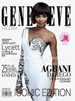
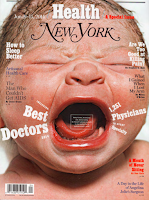
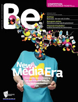
c. Take a look through some of these magazine covers and answer the following questions in the same word document.
Heading: Magazine Cover Design.
1. What do each of the three magazine covers you chose have in common? Think about the use of visuals and text and the visual hierarchy (order of importance).
2. Which magazine cover does the best job of creating/adhering to the principle of contrast? Proximity? Alignment? Repetition?
3. Which magazine cover does the best job of staying connected to the theme of the magazine and content? What design devices are used to convey the theme? (think visual images, layout, typography, colour)
Click HERE for some great magazine covers to view.
Choose three magazine covers that are successful at adhering to the 4 extremely important design principles.
Copy and paste the 3 you chose into your word document so that they are presented across the page, like this:
2. Brainstorm ideas (Wednesday Jan. 20 - 9:30 - 10:05)
Internet, magazines on bookshelf
Create a sketch of your idea that includes the theme, title, and how you will photograph the person/yourself
Include your fictional article ideas so you don't have to think later.
3. Take your photos (Thursday Jan. 21)
Use the green screen and lights in room 141 to take your photos. Ms. Silverman can help with this
4. Edit in Photoshop (Thursday Jan. 21 and Friday Jan. 22)
Create your photoshop document and start building your magazine cover.
Drop into Culminating folder marked Magazine Cover
5. Artist Statement (2-3 paragraphs in a word doc)
Write a brief statement discussing how you used proximity, contrast, alignment and repetition in your magazine cover. Then discuss how your choice of typography, colour and image helped to express the theme of your magazine.
Copy and paste the 3 you chose into your word document so that they are presented across the page, like this:


2. Brainstorm ideas (Wednesday Jan. 20 - 9:30 - 10:05)
Internet, magazines on bookshelf
Create a sketch of your idea that includes the theme, title, and how you will photograph the person/yourself
Include your fictional article ideas so you don't have to think later.
3. Take your photos (Thursday Jan. 21)
Use the green screen and lights in room 141 to take your photos. Ms. Silverman can help with this
4. Edit in Photoshop (Thursday Jan. 21 and Friday Jan. 22)
Create your photoshop document and start building your magazine cover.
Drop into Culminating folder marked Magazine Cover
5. Artist Statement (2-3 paragraphs in a word doc)
Write a brief statement discussing how you used proximity, contrast, alignment and repetition in your magazine cover. Then discuss how your choice of typography, colour and image helped to express the theme of your magazine.
Evaluation:
Proximity is used to organize, create structure and connect related elements
Contrast used to attract attention, good amount of difference between elements creates a dynamic cover design
Repetition is used to create unity by adding common elements (fonts for common elements are similar, other elements are repeated to create harmony), and for visual interest
Alignment is used to help the eye follow content and create a connection with the material and helps organize material
Overall design adheres to a theme
Photograph is well taken, well edited and "pops" off the cover.
Background helps create contrast
Simplicity (not too busy) allows for the eye to move around the page easily without overwhelming the reader
Product looks finished and professional
Culminating Mark Breakdown
Star Wars DVD + Disc = 14%
Magazine Cover = 9%
Written research = 3%
Written artist statement = 4%